The Graceful Cookie
Brand & Packaging Redesign
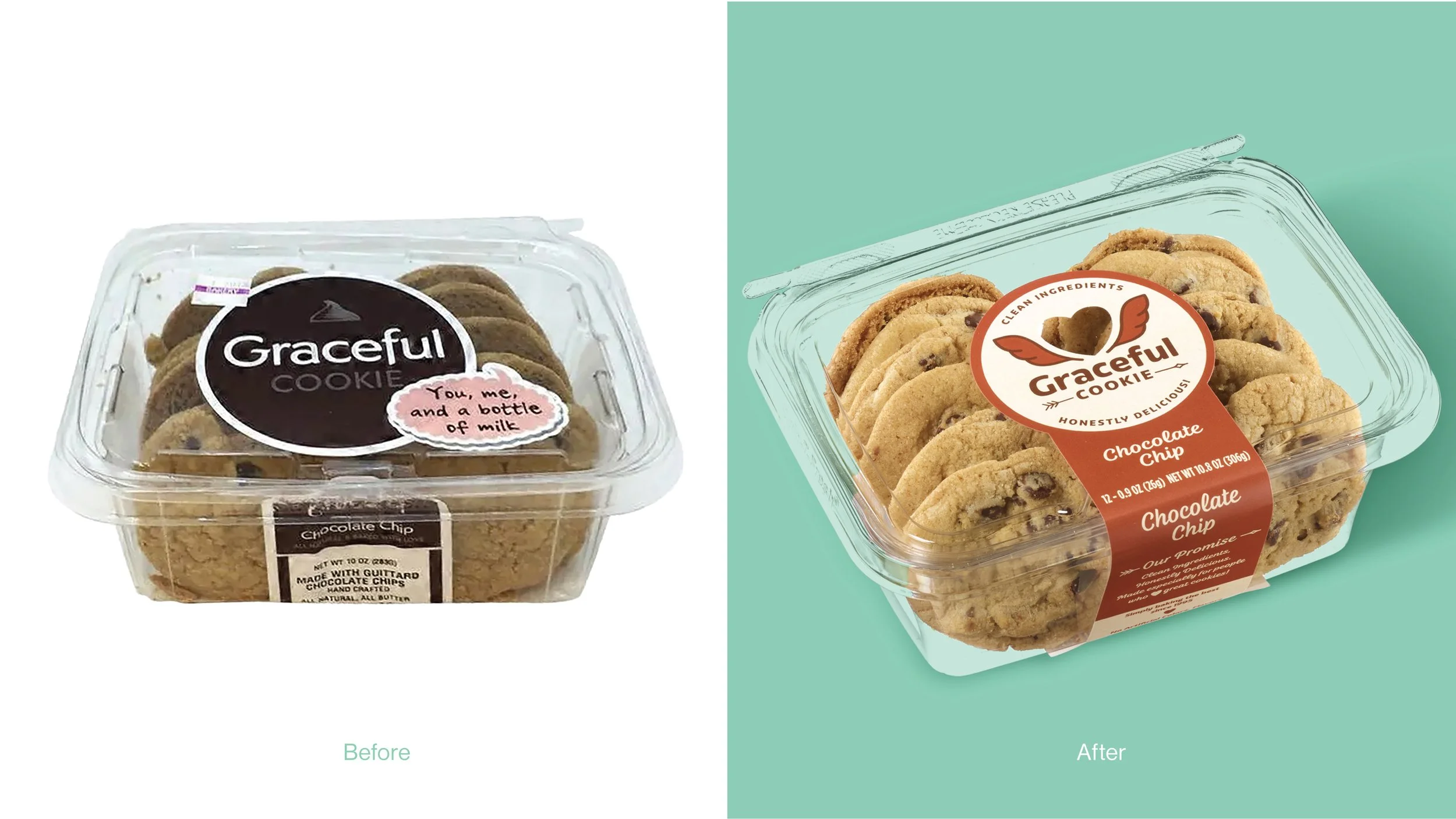
Challenge
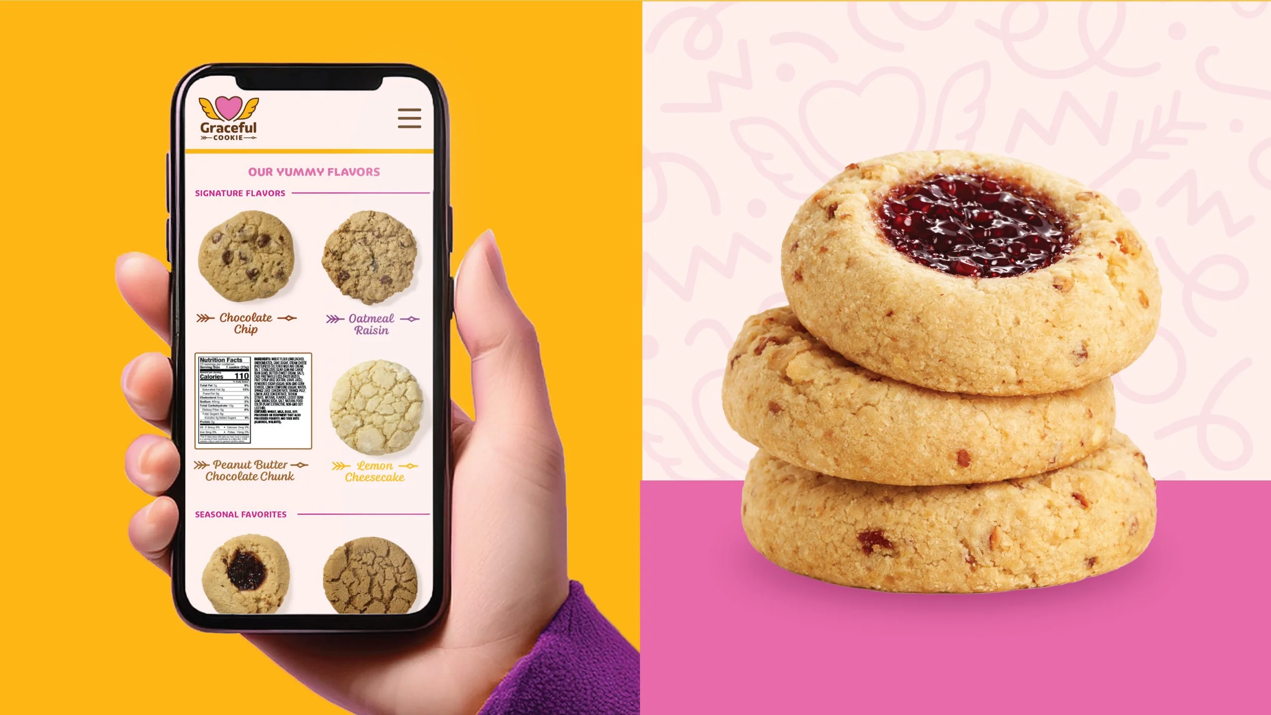
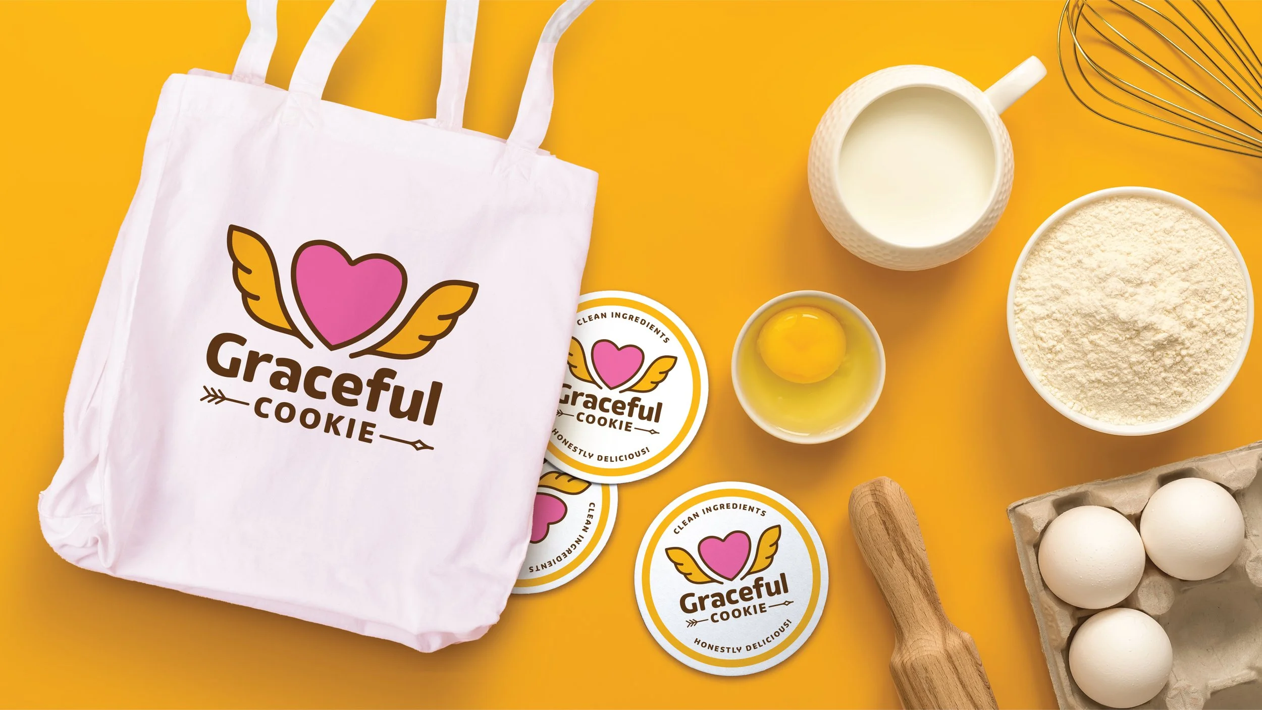
Graceful Cookie had built a loyal following with its clean, artisan recipes, but its packaging lacked the presence and professionalism needed to compete at retail. On shelf, the brand felt inconsistent and unrefined—more like a homemade label than a scalable, trustworthy product line. As the company prepared to expand distribution, it needed a cohesive identity that would stand out among national competitors while clearly communicating its core attributes: clean ingredients, honest recipes, and undeniably delicious flavors.
Solution
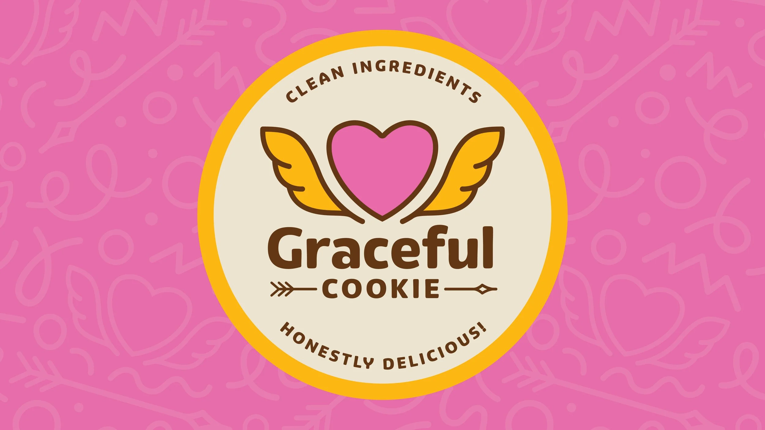
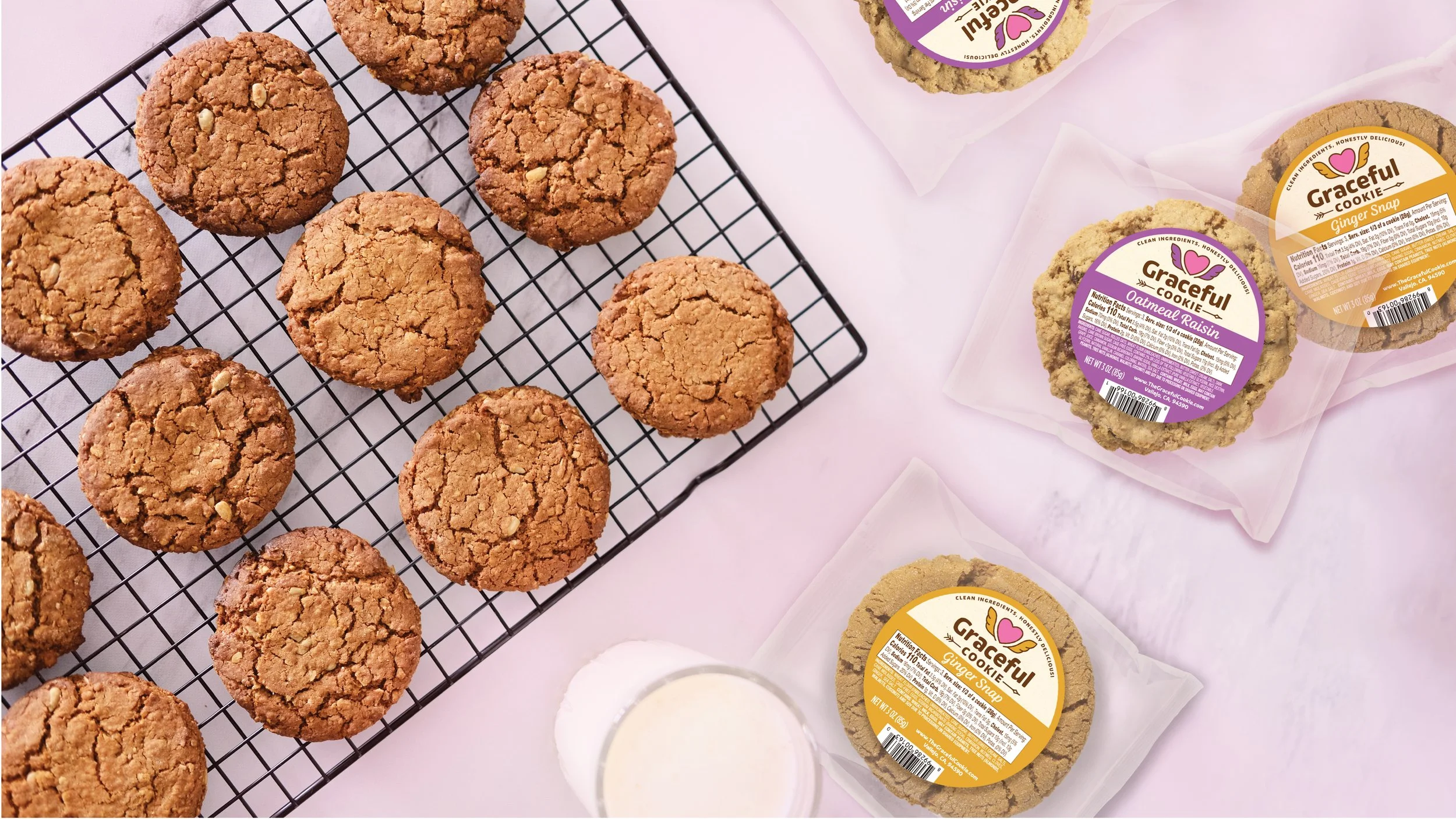
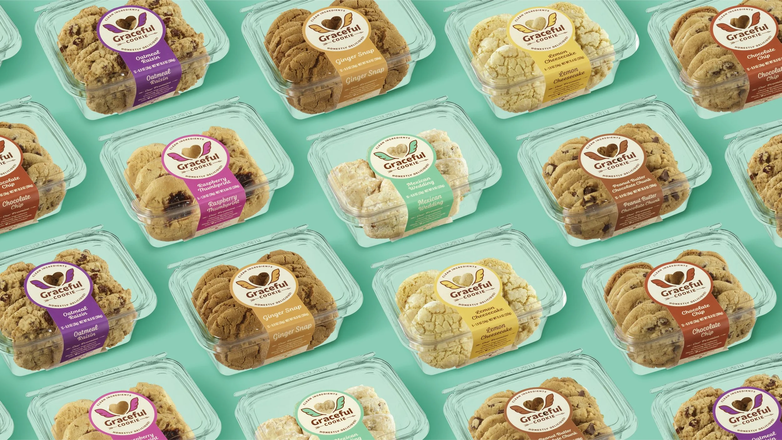
We reimagined Graceful Cookie with a bold, ownable identity rooted in love and purity. Centered around a heart with angel wings, the new mark brings to life the brand’s name “Graceful”, while subtly signaling clean, elevated ingredients. A cupid-inspired arrow underscores “Cookie,” reinforcing the universal truth that everyone loves a great cookie. Paired with a warm, modern color palette and flavor-coded packaging system, the redesign creates strong shelf impact, builds trust, and delivers a brand that feels as premium and joyful as the product inside.