Hi-Chew®
Brand Packaging Redesign
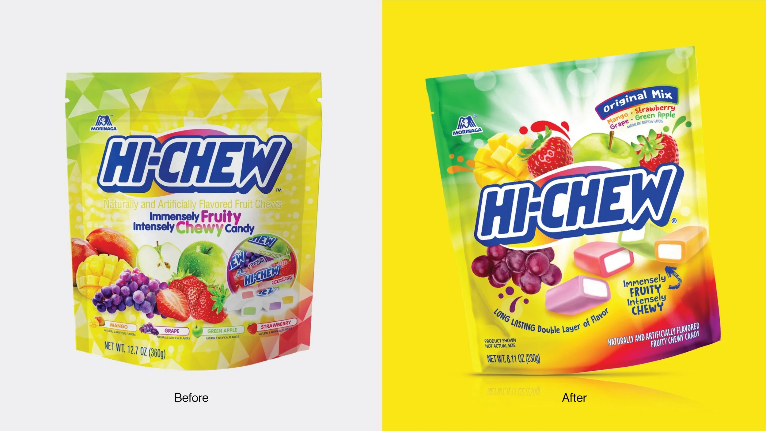
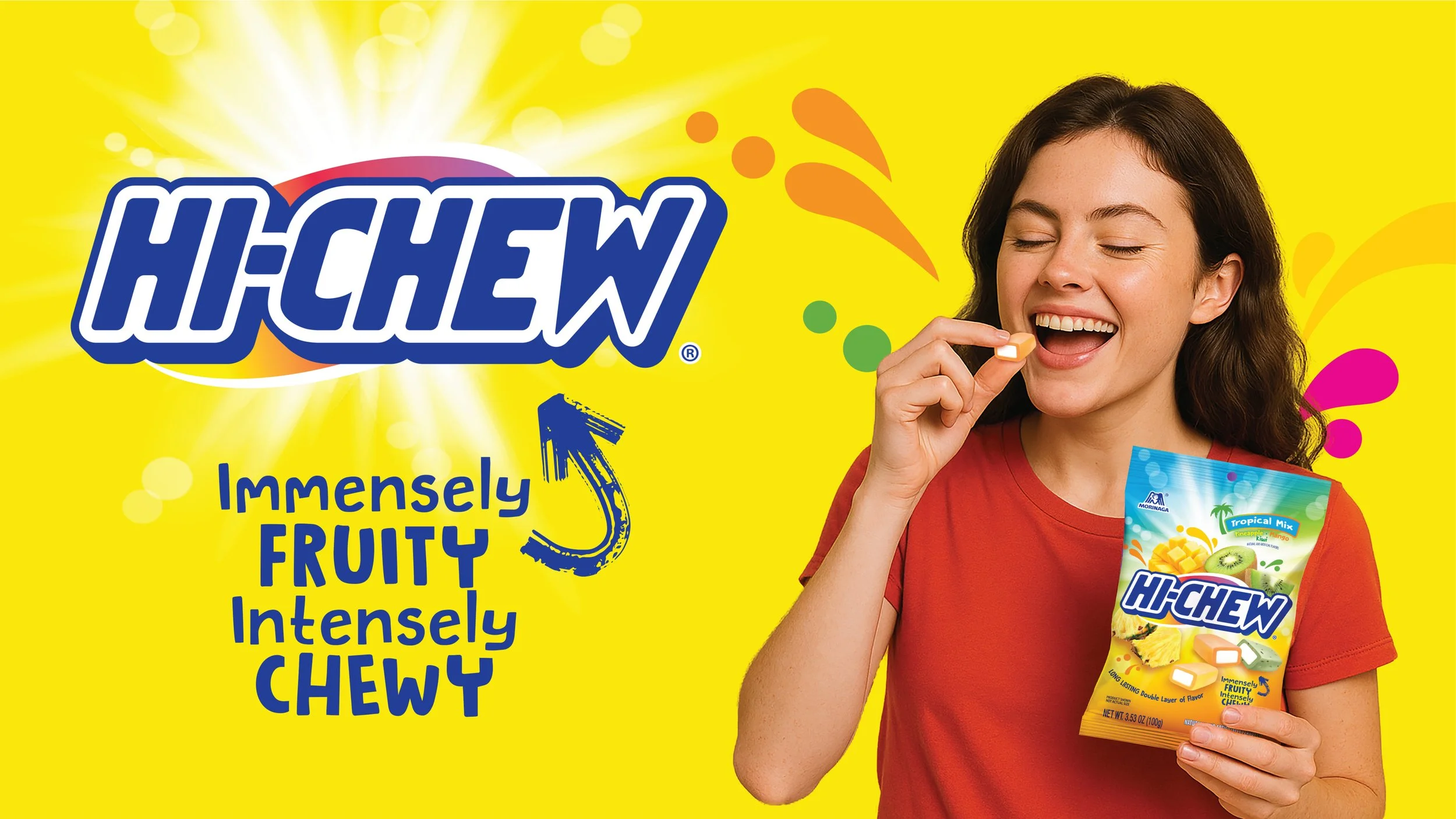
HI-CHEW has long been a best-selling candy in Japan and continues to gain traction in the U.S. market with its soft, chewy texture and juicy, fruity flavors.
As competition intensifies, the brand needed stronger shelf presence to attract U.S. shoppers and stand out in the confectionery aisle while not feeling like an import. With its last packaging update in 2017, new research revealed a key opportunity to modernize and better reflect the brand’s unique point of difference: authentic, long-lasting fruit flavor chews. The goal was to compete more effectively with national brands while staying true to its loyal consumer base and appealing to younger U.S. audiences.
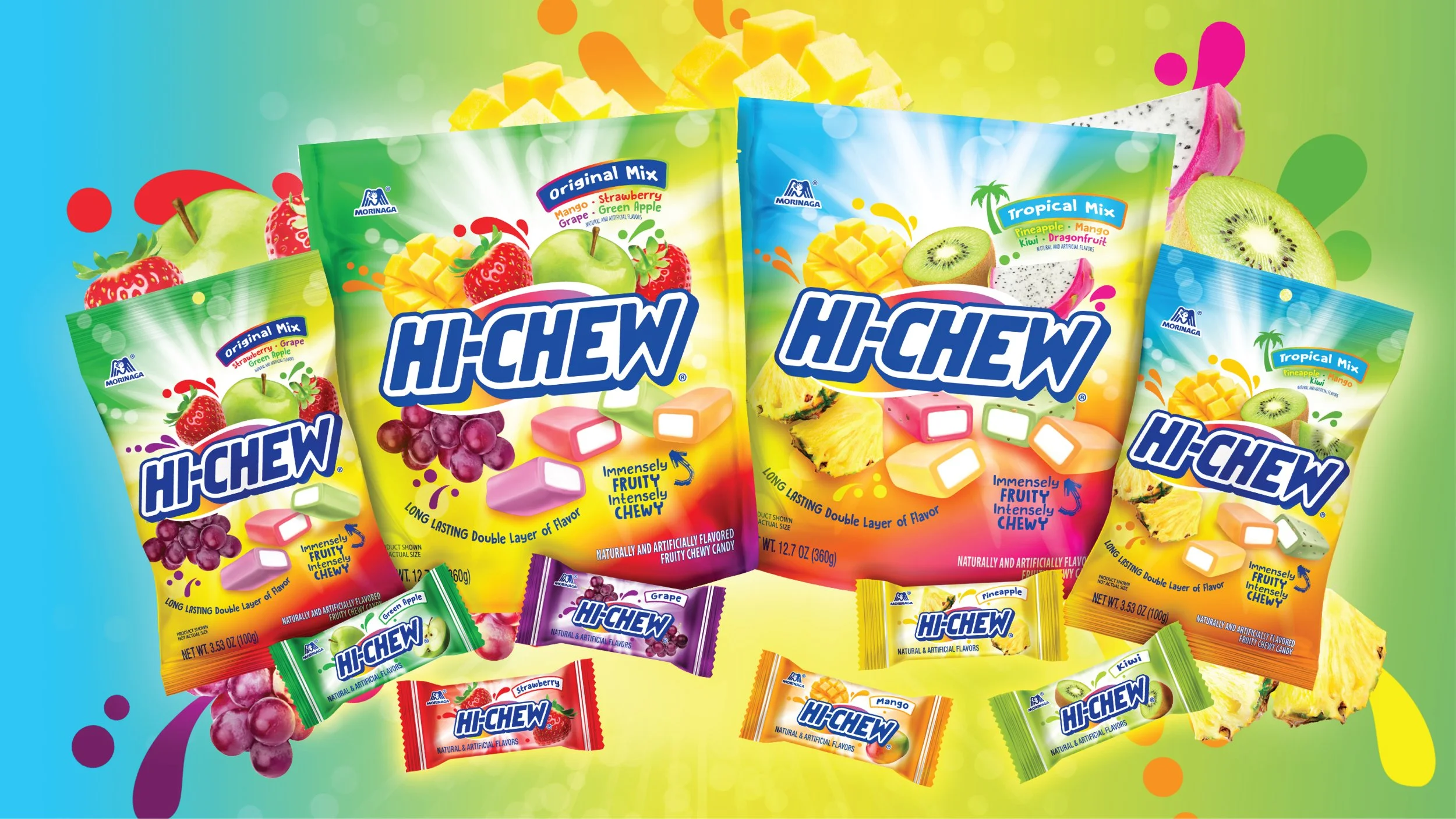
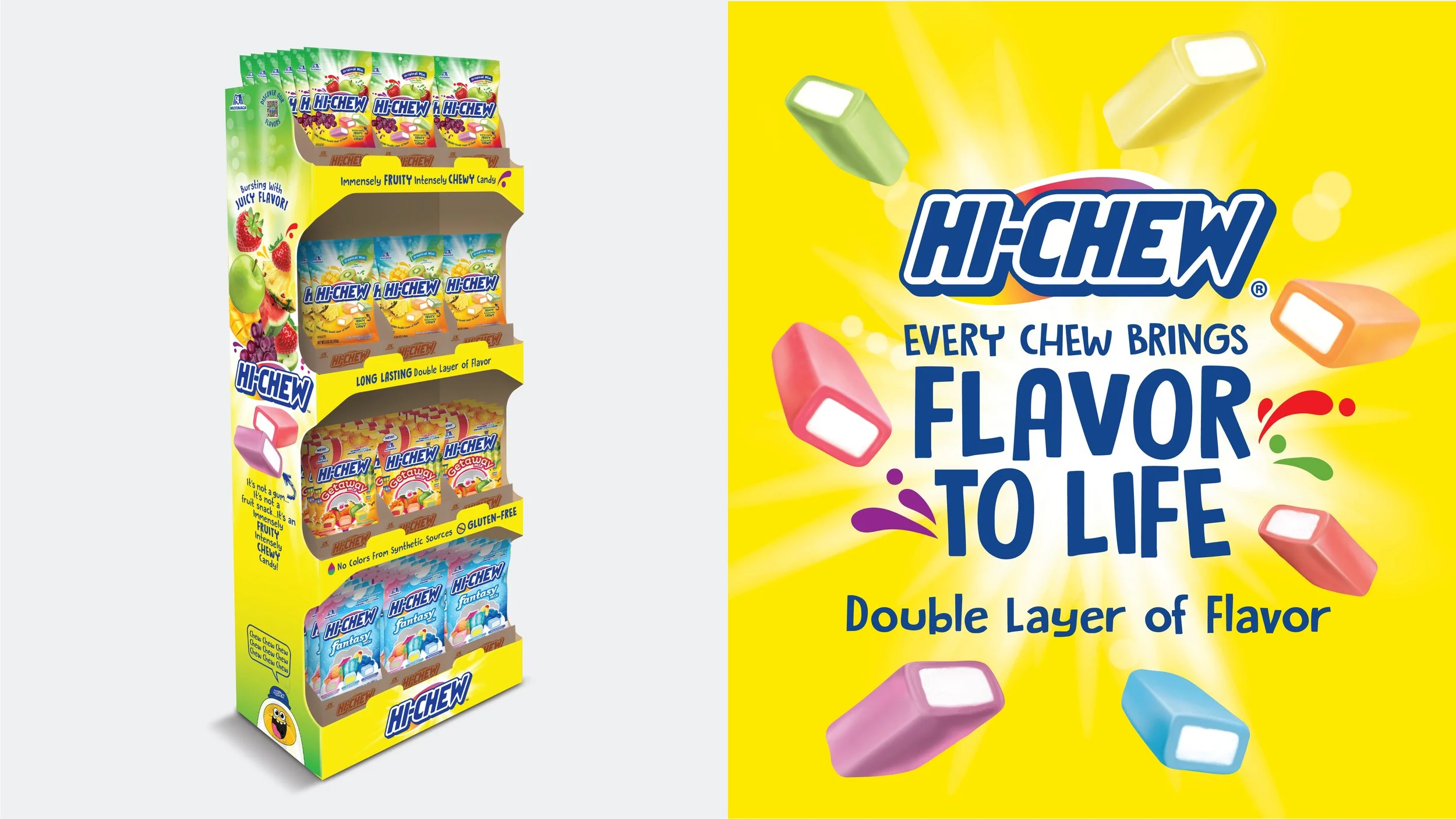
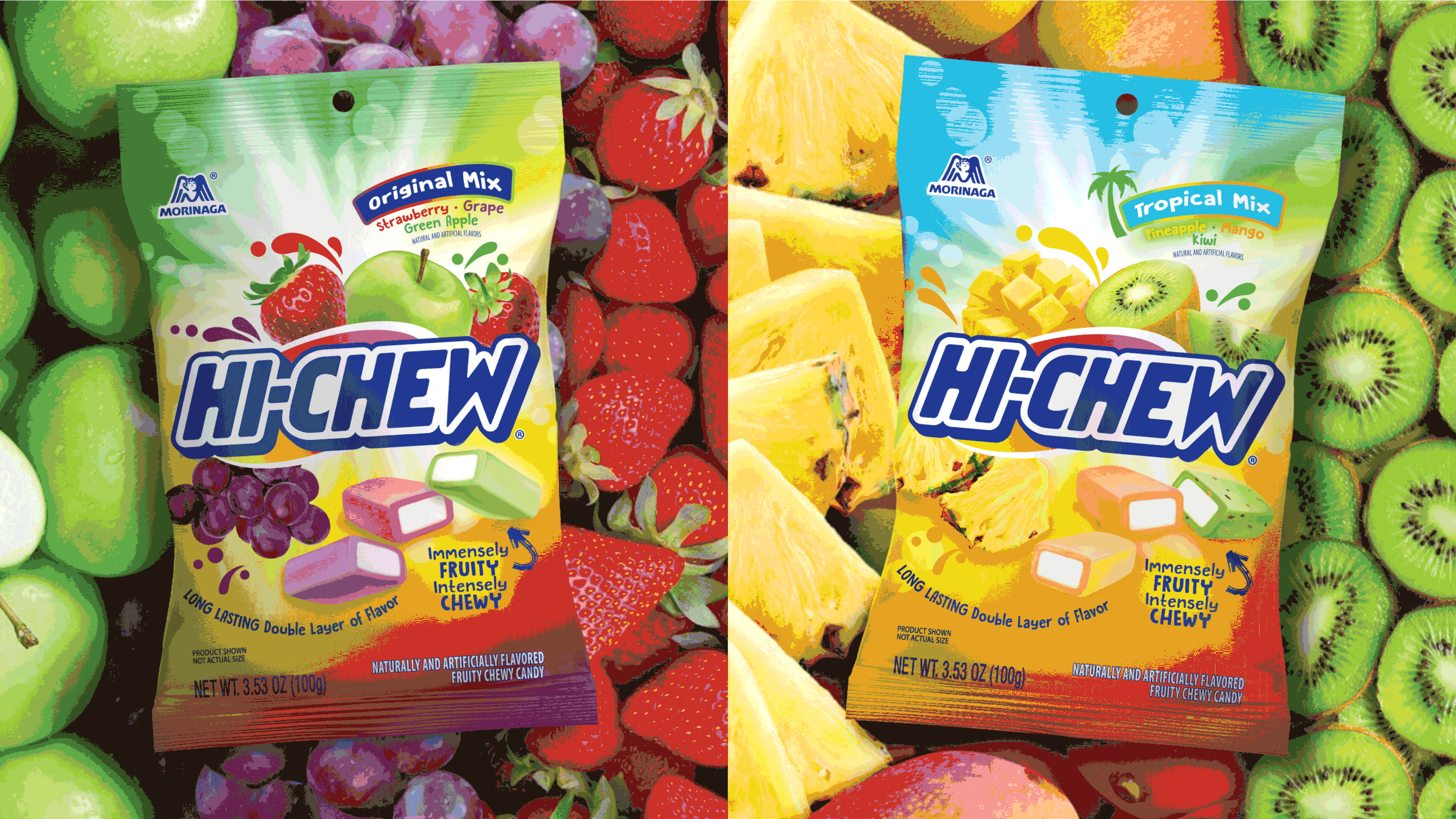
We reimagined HI-CHEW with a fresh visual identity that celebrates flavor and joy. The new packaging expresses the brand’s mission to craft high-quality, true-to-flavor candies that instantly transport consumers to moments of delight and delicious flavors. Vibrant colors, bold fruit imagery, clear communications, and modern design cues connect with Gen Z and young millennial audiences, giving HI-CHEW a confident, shelf-dominating presence that feels much more relevant in US stores yet unmistakably HI-CHEW.